

Lesson 7: Creating a tabular report
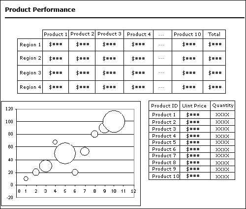
A report about performance of products is needed, in which the product ID is less than or equals to 10. The report includes annual sales of every product in every region, their unit price, the quantities that are sold, and the total of their annual sales of every product. The report should contain a crosstab, which is to represent annual sales of ten products in every region, a chart object, which is to represent quantities and total annual sales of these specified products, and a banded object, which is to represent the unit price and quantities.
Here is a sketch of the report that you can refer to:
In this lesson, we will create a tabular report and insert crosstab object, chart object and banded object respectively into different tabular cells, so that components in the report can be arranged easily with the tabular layout. Meanwhile, all the data resources we need for creating the report have been predefined in the JinfonetGourmetJava.cat catalog file, so in this lesson, we do not need to create them ourselves.
Follow the tasks below to finish creating the report:
Task 1: Create the tabular report
- From the File menu in JReport Designer, select New > Page Report.
- In the New Page Report dialog, clear the text in the Report Title text box, select Tabular from the layout box, then click OK.
Be sure that JinfonetGourmetJava.cat is specified as the current catalog because it is the catalog we use in this track. For information about specifying this catalog, see Task 1, Step 2 of Lesson 1.
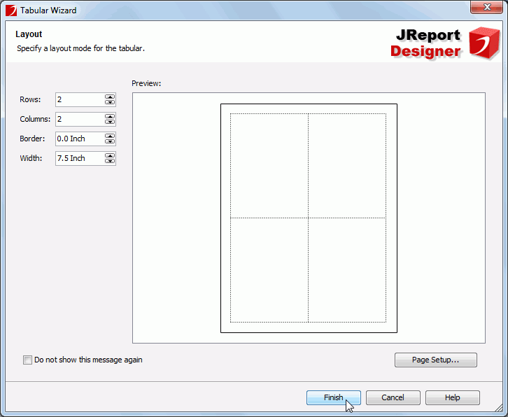
- In the Tabular Wizard, keep the default settings and then click Finish to create a 2*2 tabular.
- A message dialog appears prompting you to drag and drop data fields and components to the blank report. Click OK in the message dialog to close it.
Now a blank report with a 2*2 tabular is generated. In the Report Inspector, they are respectively named TabularCell and TabularCell1 (the two cells in the first row of the tabular); TabularCell2 and TabularCell3 (the two cells in the second row of the tabular). We can then insert different components into the cells, so that they can be easily aligned just by adjusting the tabular cells.
The tabular fills the whole page panel, we can resize it by just dragging its cell borders. In this lesson, in order to make screen captures, we zoom out the tabular first.
Task 2: Add components to the tabular report
Before taking this task, make sure you have enabled the Insert field name label with field option in the Options dialog as noted at the end of Lesson 3. Otherwise, the name labels will not be inserted together with the fields when you add fields to the report.
In this task, we will add three components - a crosstab, a chart and a banded object respectively to TabularCell, TabularCell2 and TabularCell3 and make them share the same dataset so as to improve performance.
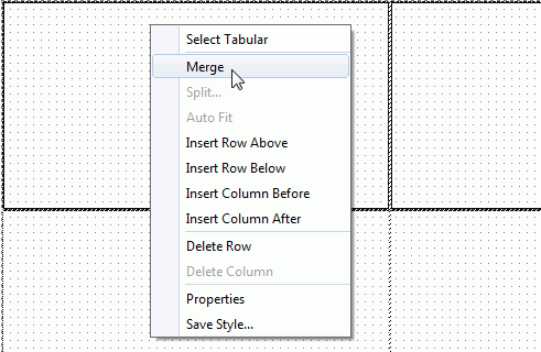
- Select TabularCell and TabularCell1 (the two cells in the first row of the tabular) by pressing the Ctrl button, right-click and then select Merge from the shortcut menu.
- Select the merged tabular cell and click Insert > Crosstab. The Create Crosstab wizard appears.
- In the Data screen of the wizard, check the New radio button, select the query ProductPerformance in Data Source 1, then click Next.
- In the Display screen, add the Products_Product ID DBField to the Columns box, the Region_AbbreviationName formula to the Rows box, the Total formula to the Summaries box and specify its aggregate function as Sum.
- Switch to the Style screen and apply the Classic style to the crosstab, then click Finish to close the Create Crosstab wizard and place the crosstab in the first tabular cell row.
Next, we will insert the chart object to TabularCell2:
- Select TabularCell2 (the left cell in the second row of the tabular) and click Insert > Chart. The Create Chart wizard appears.
- In the Data screen of the wizard, check the Existing radio button, select the dataset ProductPerformance, then click Next.
- In the Type screen, select the Bubble 2-D type and click Next.
- In the Display screen, add the two summaries Count_QuantitybyProductID and Sum_ProductSalesbyProductID to the Y Axis and Radius respectively in the Show Values box. Then the DBField ProductID_FK1 will be added to the Category box automatically. Leave the Series box empty.
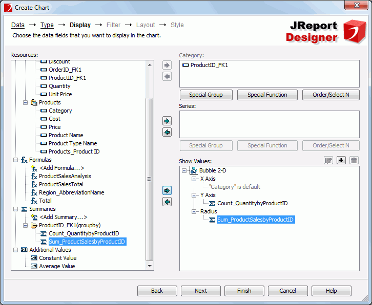
- Switch to the Layout screen, select Title in the Options box, then specify Category(X) Axis Title as Product ID, and Value(Y) Axis Title as Quantity. Click Next.
- In the Style screen, select Classic from the Style list. Click Finish to close the Create Chart wizard and drop the chart in TabularCell2.
Next, we will insert the banded object to TabularCell3:
- Select TabularCell3 (the right cell in the second row of the tabular), and then click Insert > Banded Object. The Create Banded Object wizard appears.
- In the Data screen of the wizard, check the Existing radio button, select the dataset ProductPerformance, then click Next.
- Switch to the Group screen and add the DBField ProductID_FK1 as the group by field.
- Go to the Style screen and select the Classic style for the banded object. Click Finish to close the Create Banded Object wizard and then click in TabularCell3 to place the banded object in it.
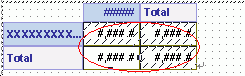
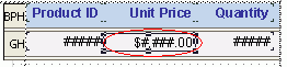
Now, the three objects look as follows in the tabular:
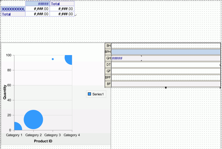
-
Delete the group by field in the GroupHeader panel of the banded object.
-
Drag the DBFields ProductID_FK1, Unit Price and the summary Count_QuantitybyProduct ID from the Resource View panel and drop them in the GroupHeader panel.
- Adjust the added fields, move the three name labels to the BandedPageHeader panel, and then change the names of ProductID_FK1 and Count_QuantitybyProduct ID to Product ID and Quantity respectively.
- Right-click in the BandedHeader panel and select Hide from the shortcut menu to hide it from view.
Repeat this to hide all panels
that do not hold data.
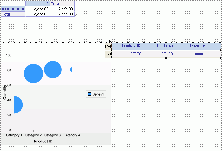
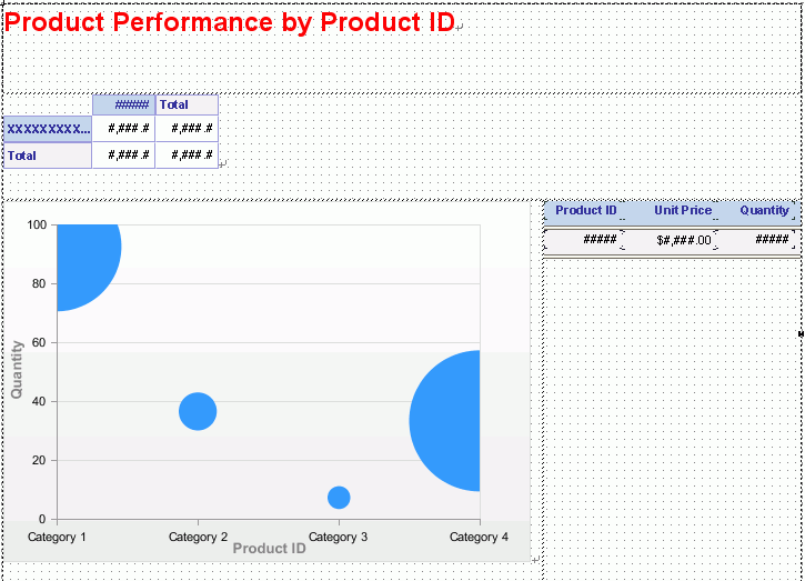
Now the report shows as follows:
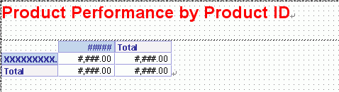
Next, we need a report title for the tabular report to make the report look professional.
- Right-click the tabular cell that holds the crosstab, and then select Insert Row Above from the shortcut menu, and then resize the rows to a suitable height.
- Double-click the newly-created tabular row, and enter the text Product Performance by Product ID as the report title, then select the text, right-click on it and select Font from the shortcut menu.
- In the Font tab of the Format Text dialog, set Font to Arial, Font Size to 18, Font Color to Red and Bold to true, then click OK.
The title appears as follows:
In this lesson, we will use the Filter feature to limit data selected from the dataset to view the products performance from the Product ID 1 to 10. Since all the components in the report share the same dataset, the filter will be applied to all of them.
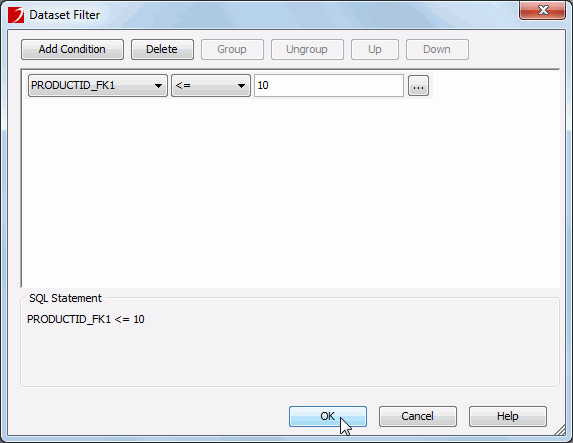
- Click the Dataset Filter button
 on the toolbar of the Resource View panel.
- In the Dataset Filter dialog, click the Add Condition button to add a filter line and specify the filter condition as ProductID_FK1 <= 10, then click OK.
Task 3: Format the report
To improve the report appearance, we need to do some adjustments to the report, as well as the components in it:
- Resize the tabular cells according to the components' sizes in every cell, so that they will not be truncated by the tabular and can display well.
Next, we will further format to improve the appearances of the components. First, we will format the crosstab.
- Select all the objects in the crosstab and then set their Font Face property to Arial and Font Size to 8.
- Select the four DBFields in the crosstab, and specify their Height to 0.25, Width property to 0.59, and Format to #,###.# in the Report Inspector, so that their data can be displayed completely in the cells.
Next, let's format the chart.
- Double-click the label Quantity in the chart, then in the Font tab of the Format Label dialog, set Font Face to Arial, Font Size to 10pt and Font Color to 808080. Click OK to accept the settings.
- Use the same way to format the label Product ID in the chart.
- Right-click the chart and then click Hide Legend on the shortcut menu to hide the legend.
Then, we will format the banded object.
- Select all the objects in the banded object and then specify their Font Face property to Arial in the Report Inspector.
- Select the three DBFields in the GroupHeader panel, set their Foreground property to Black and Bold to false.
- Select the Unit Price DBField and then specify its Format property to $#,###.00.
After doing the adjustments, the report appears somewhat like follows in design view:
According to the sketch, a line needs to be added below the report title. We can do this just by setting tabular cell properties.
- Select the tabular cell holding the report title, then in the Report Inspector, specify its Top Line, Left Line and Right Line properties to none, Border Color to Gray and Border Thickness to 0.01.
When viewing the report, the crosstab object displays much closer to the line we just customzed and the other two components and looks too clumsy. We need to do some adjustments, which can be done easily by using the function of a tabular.
- Right-click the tabular cell holding the crosstab, and then select Insert Row Above from the shortcut menu. Right-click the cell again and select Insert Row Below.
Two rows are now added above and below the crosstab.
-
Resize the tabular rows to adjust the distances between the crosstab and the other components.
- On the report tab bar, right-click the report tab and select Rename from the shortcut menu to rename the report tab as ProductPerformance.
- Click File > Save to save the report as ProductPerformancebyProductID.cls.
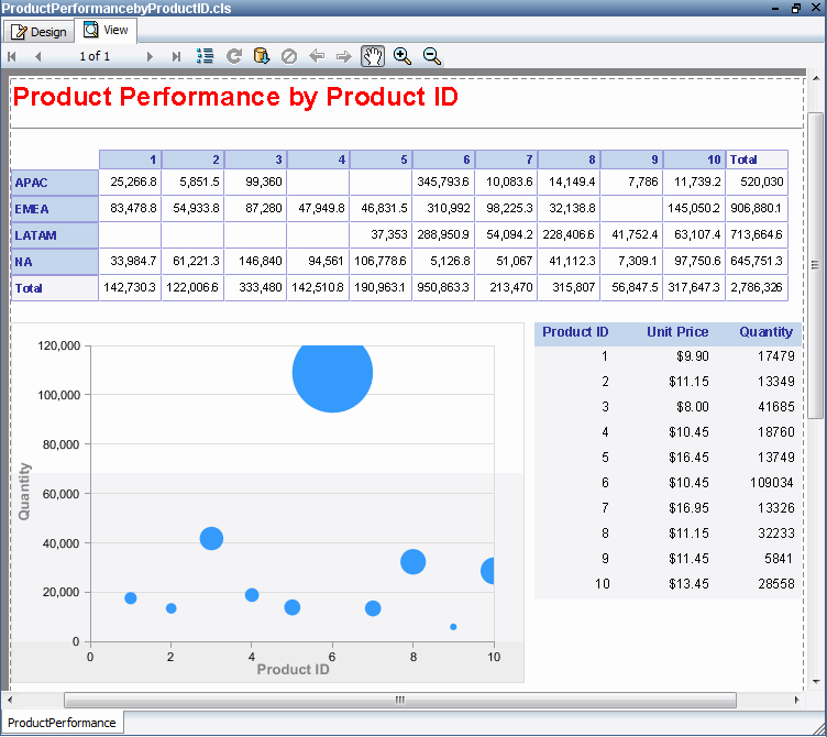
- Click the View tab, and the report appears as follows, depending on what formatting you have done to the components.
Note: If the report does not look correct, you can compare it to the final version of the report provided by JReport. To do so, you will need to save and close this catalog and then open the JinfonetGourmetJava.cat catalog file located at <install_root>\Demo\Reports\TutorialReports.
Lesson 7 summary
In this lesson, we created a tabular report that contains a crosstab object, a chart object and a banded object. It represented the unit price, quantity and annual sales, and sales total in every region about the products, of which the product ID is less than or equals to 10. The category(X) axis of the chart showed the product ID, value(Y) axis showed the quantities, and the size of bubbles showed the annual sales.