

The following table lists the JReport chart types.
| Bar | ||
 |
Clustered Bar 2-D | Clustered Bar. Displays and compares data values across categories. |
 |
Stacked Bar 2-D | Stacked Bar. Displays and compares the contribution of each data value to a total across categories. |
 |
100% Stacked Bar 2-D | 100% Stacked Bar. Displays and compares the percentage that each data value contributes to a total across categories. |
 |
Clustered Bar 3-D | Clustered bar with a 3-D visual effect. |
 |
Stacked Bar 3-D | Stacked bar with a 3-D visual effect. |
 |
100% Stacked Bar 3-D | 100% stacked bar with a 3-D visual effect. |
 |
Bar 3-D | 3-D Bar. Displays and compares data values across categories and series. |
| Bench | ||
 |
Clustered Bench 2-D | Clustered Bench. Displays and compares data values across categories. |
 |
Stacked Bench 2-D | Stacked Bench. Displays and compares the contribution of each data value to a total across categories. |
 |
100% Stacked Bench 2-D | 100% Stacked Bench. Displays and compares the percentage that each data value contributes to a total across categories. |
 |
Clustered Bench 3-D | Clustered bench with a 3-D visual effect. |
 |
Stacked Bench 3-D | Stacked bench with a 3-D visual effect. |
 |
100% Stacked Bench 3-D | 100% stack bench with a 3-D visual effect. |
 |
Bench 3-D | 3-D Bench. Displays and compares data values across categories and series. |
| Line | ||
 |
Line 2-D | Line. Displays trend over categories. |
 |
Stacked Line 2-D | Stacked Line. Displays the trend of the contribution of each data value over categories. |
 |
100% Stacked Line 2-D | 100% Stacked Line. Displays the trend of the percentage each data value contributes over categories. |
 |
Line 3-D | Line with a 3-D visual effect. |
| Area | ||
 |
Area 2-D | Displays the trend of the values over time or categories. |
 |
Stacked Area 2-D | Stacked Area. Displays the trend of the contribution of each data value over categories. |
 |
100% Stacked Area 2-D | 100% Stacked Area. Displays the trend of the percentage each data value contributes over categories. |
 |
Area 3-D | Area with a 3-D visual effect. |
 |
Stacked Area 3-D | Stacked area with a 3-D visual effect. |
 |
100% Stacked Area 3-D | 100% stacked area with a 3-D visual effect. |
| Pie | ||
 |
Clustered Pie | Pie. Displays the contribution of each data value to a total over time or categories. |
 |
Clustered Donut | Donut. Displays the contribution of each data value to the Category total. The size of each piece is proportional to the sum of the items. Each Series value will create a new instance of the chart. |
| Radar | ||
 |
Radar 2-D | Displays and compares the data values relative to a center point. |
| Organization (Org) | ||
 |
Org 2-D | Displays the structure of an organization and the relationships and relative ranks of its parts, or the similar structures. |
| Indicator | ||
 |
Indicator 2-D | Displays each data value with a colored indicator. |
| Gauge | ||
 |
Gauge Dial 2-D | Usually displays the performance of each member in a group, using three colors, green, yellow, and red (by default) to represent three levels: normal, alert, and error. This type, displays each data value by a dial. |
 |
Gauge Bar 2-D | Displays each data value with a bar. |
 |
Gauge Bubble 2-D | Displays each data value with a colored bubble. |
| Surface | ||
 |
Surface 3-D |
Indicates what level of different values reside in, and shows the cross-relationships between category and series. |
| Scatter | ||
 |
Scatter 2-D | Compares pairs of values. |
 |
Scatter Straight Line 2-D | Scatter with data points connected by smoothed lines. |
 |
Scatter Curved Line 2-D | Scatter with data points connected by lines. |
| Bubble | ||
 |
Bubble 2-D |
Compares sets of 3 values. Similar to a scatter chart with the third value displayed as the size of the bubble marker. |
| Stock | ||
 |
High-Low 2-D | High-Low. Requires values of two fields. |
 |
High-Low-Close 2-D | High-Low-Close. Requires values of three fields. |
 |
Open-High-Low-Close 2-D | Open-High-Low-Close. Requires values of four fields. |
| Bullet | ||
 |
Bullet 2-D |
Bullet. Replaces the meters and gauges that are often used on dashboards. Its linear design not only gives it a small footprint, but also supports more efficient reading than radial meters. |
| Heat Map | ||
 |
Heat Map | Displays values by colors and sizes in a matrix. |
| Combo | ||
| Combo | Combination charts. Two or more types of data markers are used to represent different data values. | |
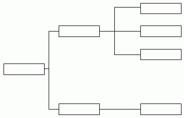
Organization chart, also referred to as org chart, is a one-root-node-tree-structure diagram showing the ownership or reporting to relations among the nodes which are mapped to a specific entity. It consists of the following elements:
Child field
The child field identifies the entity.
Parent field
The parent field defines the "reporting to" relationship among the entity members, that is, which child field member reports to or belongs to which child field member.
The relationship between the parent field and child field:
For example, if the child field is about IDs, the parent field should also be about IDs, but the parent IDs are different from the child IDs and they tell about which ID is the parent of which ID.
Here is a table:
| Child Field | Parent Field |
|---|---|
| Employee ID | Report To |
| 1 | 4 |
| 2 | 4 |
| 3 | 4 |
| 4 | 7 |
| 5 | 6 |
| 6 | 7 |
| 7 |
You can see that the parent field contains some members of the child field. From the parent field column, the employees identified by IDs 1, 2 and 3 report to the employee with ID 4, ID 5 reports to ID 6, and IDs 4 and 6 report to ID 7.
The org chart will be like this with the left to right layout:
Properties
The properties define the information shown in the nodes related to the entity. Data fields, labels and images can be added as properties into the nodes.
Layout modes
The org chart tree structure can be laid out in one of the three modes:
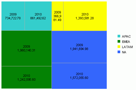
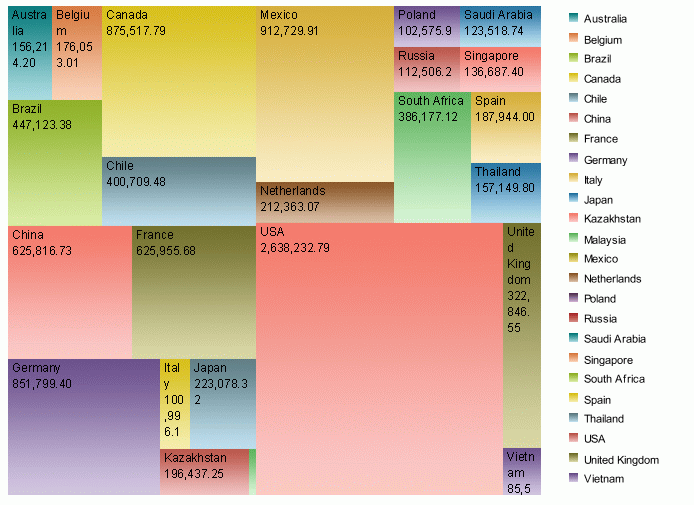
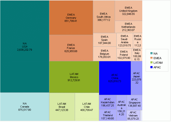
Heat map is composed of rectangles marked by colors and sizes.
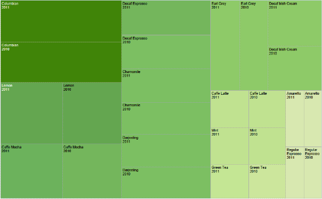
The following introduces the concepts used in heat map:
Groups are used to group the data. A heat map contains one or more groups. The following fields can be used as groups:
A field can only be added in the groups of a heat map once.
Each combination of the members of the groups is represented by a rectangle. A rectangle has title, body and borders, and has color and size properties. Rectangle title is used to show the corresponding group value at runtime.
Each rectangle contains a rectangle header where the rectangle title resides in and a sub rectangle if it has a sub group.
Only the innermost rectangle is able to hold fields/labels/images directly. If the innermost rectangle is changed, the contents (fields, label etc.) of the old innermost rectangle will be moved into the new innermost rectangle automatically. That is to say, changes of the group structure have no effect on the contents of the innermost rectangle.
Within the innermost rectangle's body, you can insert labels/images or input text directly as you do in text box. The inserted objects do not support absolute position since the width and height of the rectangles are determined dynamically during runtime according to size-by fields.
A heat map can have zero or one size-by field. The size-by filed is used to determine the size of each rectangle. It can be one of the following:
During runtime, the negative values of the size-by field will be ignored.
Color-by fields are used to determine the fill color of each rectangle. A heat map may have 0 to n groups and 0 or 1 summary as the color-by fields. Groups here mean the groups of the heat map. The summary can be one of the following, similar to the size-by field:
The size-by field and the color-by field can be the same.
There are two ways to specify the fill color of a heat map: Use Single Color and Use Single Color with Condition.
Example 1: color by regions with single colors
Example 2: color by countries with gradient colors
There are two scenarios as follows:
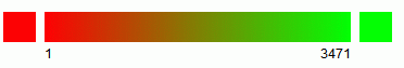
Here is an example in which the color-by field is a measure Sum(Quantity). The start color is red and the end color is green.
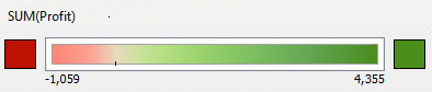
Here is an example in which the color-by field is a measure Sum(Profit). The start color is red and the end color is green, with zero mapped to white.
The gradient colors change from the start color to the end color directly, the same way as that when mapping zero to no color.
The null value of a summary can be mapped to a color specified by the Color When Null property.
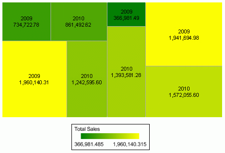
Example: color by total sales
In order to avoid that the rectangles with the minimum values always take pure white color, the minimum value used to calculating color is less than the original minimum value: newMinimum = originalMinimum - (Maximum - originalMinimum ) *10%
For example, if the color is green, the gradient colors will be in the following range:
The null value of a summary can be mapped to a color specified by the Color When Null property.
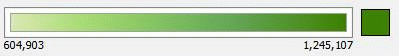
Example: color by regions and total sales
Use Single Color with Condition
Each rectangle has its single color pattern based on defined conditions. Color-by does not work in this case.
For each summary/measure used as the size-by or color-by field, you can choose to use its logarithmic value as well as the real value. Two logarithmic functions are provided:
If x is invalid to calculate logarithm, return null. Logarithmic values of the summaries/measures can be used as the real values when calculating sizes and colors of the rectangles.
Bad layout in JReport Designer preview and in the exported results when separator thickness is set to a big value.