A chart organizes and graphically presents data in a way that makes it easy for end users to see comparisons, trends, and patterns in data. It represents the report data in a visually straightforward form. A chart is based on the chart platform. On the platform, the chart paper, the legend, and labels make up the chart. You can create a chart that contains only simple DBFields, or a complicated chart that contains DBFields, groups, summaries, and even formulas. Normally, DBFields, summaries, and formulas in a report are represented in a chart using chart data markers, and groups are used to produce category names and data series names. DBFields can also be used as category names.
For details about the chart types JReport supports, see Chart types in the JReport Designer User's Guide.
For how charts present data, see How data is represented in a chart in the JReport Designer User's Guide.
For the elements that compose a chart, see Chart elements in the JReport Designer User's Guide.
To create a chart report, follow the steps below:
A default chart type exists in the Chart Type Groups box. To replace it with another one, select a chart type from the Chart Type box. The thumbnails of the subtypes in this type will then be displayed in the Subtype box. Select the required subtype to replace the default chart type.
If you want to create a combo chart, click <Add Combo Type> of Primary Axis or Secondary Axis in the Chart Type Groups box, and an additional subtype will be added. To replace the additional subtype, select it, then specify the required type and subtype respectively in the Chart Type and Sub Type boxes.
To add more subtypes, repeat the procedures. To remove a subtype, select it and click  .
.
 in the Resources box and add it to the Category or Series box, the data of which will be displayed on the corresponding axis. Select a subtype in the Show Values box, then add a measure object
  or an additional value
  as the data of the subtype.
To add an additional value to a subtype:
 beside the Show Values box. The Edit Additional Value dialog appears.
If you want to further modify a constant/average value, select the value in the Show Values box, then click  . In the Edit Additional Value dialog, edit the value as required.
You can add more than one measure object or additional value to a subtype. Each added subtype shall have at least one measure object or additional value.
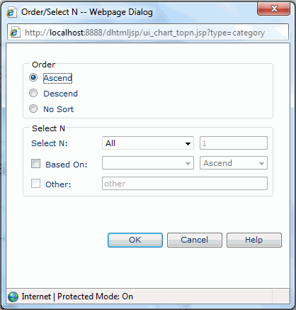
To define a sort order and Select N condition on the category/series axis:
If Based On is unchecked, the order of the first or last N category/series values will be based on what you specify in the Order box of the dialog; if you check it, the order will be based on values of the summary field and the sort direction you specify in the drop-down lists next to the Based On checkbox.
See also Chart Wizard for details about options in the wizard.
Note: If there is only one cube in the current catalog, this cube will be used to create the report by default, and the Data screen will be hidden from the wizard. This is the same case when there is only one style available to be applied to the report.