You can manipulate data components, which refer to tables, crosstabs, charts and geographic maps, in Web Report Studio as shown below. Note that, most of the manipulations require selecting the component first. To select a component, click anywhere in the component, when the icon  appears at its upper left corner, click the icon.
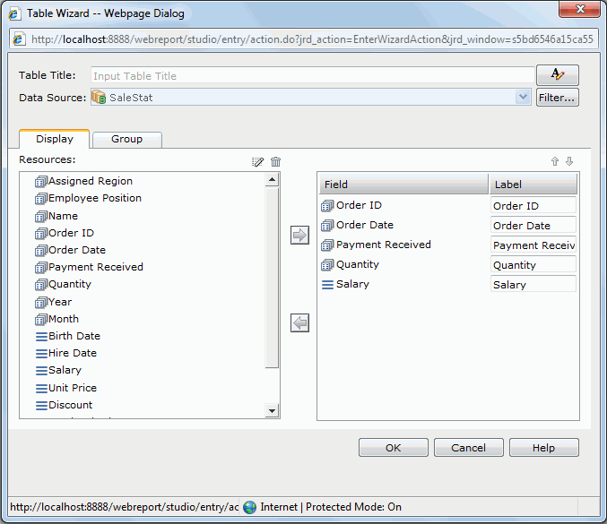
 on the Context toolbar. of the table and select Table Wizard from the shortcut menu.
 to customize the font, size, and style of the title.
For details about how to define a table, see Inserting a table.
To drag a group field into a table to become a group, drag it from the Resources panel and then move the cursor in the detail section or to the border of an existing table group until a highlighted horizontal line appears, then release the cursor, and the new group will be placed where the highlighted line lies.
To remove a table column, first select it, next drag and drop it to the Resources panel, and then confirm the removal.
 .
. When you finish summarizing a detail column, you will find a dynamic aggregation is created at the same time which is given a default name Function_DetailFieldName in the Dynamic Resource > Aggregations list in the Resources panel and you can use it again in the current report if required.
 and you will get a drop-down list of fields in the business view that can be used as group by fields. From the list you can select the field you would like to add into the table as a group. If there is no existing group in the table, the added group will be placed at the left-above position. If the table already contains groups, the new group will be added as the highest level group and follow the same position pattern as the closest existing group. on the Context toolbar of the table: unselect the group you want to remove from the drop-down list, then click Yes in the message dialog.
 To show/hide a detail column, select the table, then on the Context toolbar, click the Show/Hide Detail button  . From the drop-down list, select/unselect the field name to show/hide its detail column.
You can also hide a detail column by one of the following:
 on the Context toolbar.
To show/hide a summary from a table, first select the table and then do either of the following:
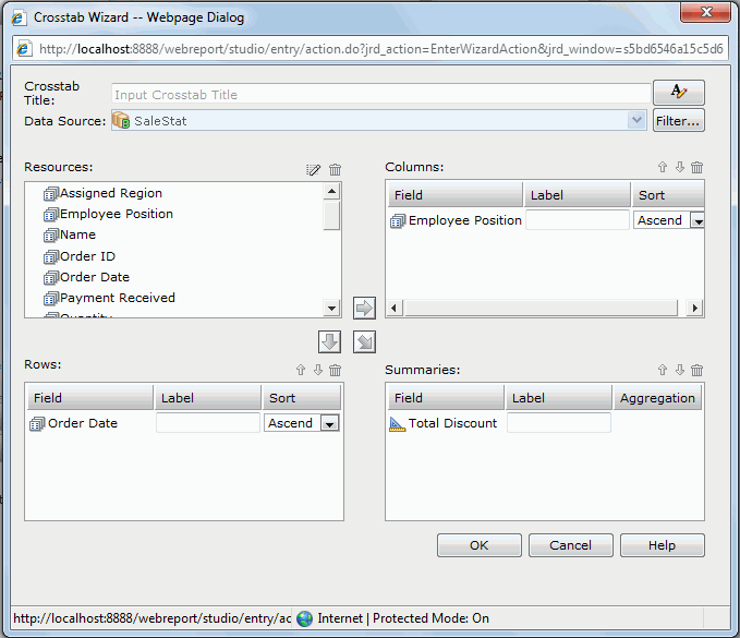
 . From the drop-down list, select/unselect the summary field name to show/hide it. of the table, then on the shortcut menu, select/unselect the summary field name from the Show > Table Column submenu to show/hide it. on the Context toolbar. of the crosstab and select Crosstab Wizard from the shortcut menu. to customize the font, size, and style of the title.
For details about how to define a crosstab, see Inserting a crosstab.
To drag a group field into a crosstab to become a row header, drag it from the Resources panel and then move the cursor to a border of the row header until a highlighted vertical line appears, then release the cursor, and the new row header will be placed where the highlighted line lies.
To drag an aggregate field into a crosstab to become an aggregation, drag it from the Resources panel and drop to the aggregation section.
To remove a row/column header or an aggregation from a crosstab, first select it, next drag and drop it to the Resources panel, and then confirm the removal.
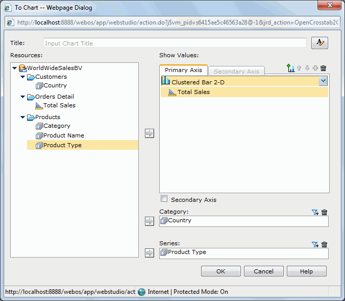
of the crosstab and select To Chart from the shortcut menu. to customize the font, size, and style of the title. from the Resources box to the Category box, and so to the Series box, and aggregation objects
  to the Show Values box respectively.
If you select a bubble chart type, you need to specify the fields to be shown on the bubble X axis, Y axis and the value you want to show as the bubble radius in the Show Values box. Note that when you specify a value for the bubble X axis, this value will be displayed on the category axis instead of the one specified in the Category box. However, the value defined in the Category box will also be included in data calculation.
For details about how to define a chart, see Inserting a chart.
To rotate a crosstab, first select it, and then do one of the following:
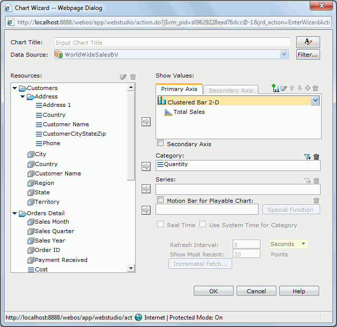
 on the Context toolbar. of the crosstab and select Rotate Crosstab from the shortcut menu. on the Context toolbar. of the chart, or right-click on the chart platform or paper, then select Chart Wizard from the shortcut menu. to customize the font, size, and style of the title.
For details about how to define a chart, see Inserting a chart.
of the chart or right-click on the chart platform or paper, then select Switch Category/Switch Series from the shortcut menu. The fields available for the category/series axis are listed in the submenu with the current used field checked. Select the field you want to use to replace the current one on the axis. of the chart or right-click on the chart platform or paper, then select Switch Value from the shortcut menu. The fields available for the value axis are listed in the submenu with the current used field checked. Click an unchecked field to add it to the value axis.
If a chart has multiple fields on its value axis, you can also click the up or down arrow beside the current used fields to adjust their order, or click a checked field to remove it from the chart. When there is only one field on the value axis, it cannot be removed.
For a combo chart, you can change the fields displayed on the chart one by one for each chart type.
of the chart or right-click on the chart platform or paper, then on the shortcut menu, select the required order from the Sort Category or Sort Series submenu. To swap the chart groups, first select the chart, then do either of the following:
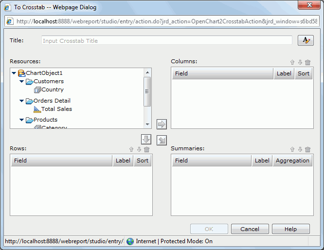
 on the Context toolbar. of the chart, or right-click on the chart platform or paper and select Swap Chart Groups from the shortcut menu. of the chart, or right-click on the chart platform or paper and click To Crosstab on the shortcut menu. to customize the font, size, and style of the title. in the Resources box and click
  or
or  to add it as a group field to the Columns or Rows box; select an aggregation object or a detail object
  and click
  to add it as an aggregate field to the Summaries box. If a detail object is added, specify the aggregate function for it in the Aggregation column. Repeat this to add more group and aggregate fields.
In the Label column, you can edit the label of a group field or aggregate field, and the Sort column allows you to specify a sorting manner on a group field.
If you want to remove any group/aggregate field, select it and click  .
.
To adjust the order of group/aggregate fields, select a group/aggregate field and click  or
or  .
.
of the chart or right-click on the chart platform or paper, then select the corresponding Show or Hide command from the shortcut menu to show or hide the legend or legend label. However, the legend will always be displayed at the exporting or printing results. . From the drop-down menu, select the desired chart type and its subtype.
 . From the drop-down menu, go to the Label submenu, then select/unselect the desired labels to show/hide them.. From the drop-down menu, go to the Gridlines submenu, then select/unselect the desired gridlines to show/hide them.
When gridlines are shown, it is better to also have the wall shown so as to make the background gridlines more intuitive. To show the wall, follow the steps above, then on the Gridlines submenu, select Wall.
. From the drop-down menu, go to the Legend submenu and select the desired position. on the upper right corner of the chart paper.
Notes: