

Lesson 1: Creating page reports
The easiest way to create a page layout ad hoc report is to use the JReport Standard Report Wizard. There are several types of reports in the wizard which collects information for you: blank (no component), banded, crosstab, table, and chart. You can add components to or remove them from the report after it is generated by the wizard. In this lesson, we will create a page report that contains three report tabs.
This lesson contains the following tasks:
Task 1: Create a banded report
- Click Start > All Programs > JReport 13 Update 1 > Server > Start JReport Server to start JReport Server.
- Click Start > All Programs > JReport 13 Update 1 > Server > JReport Server Console, or open a web browser and set the URL to http://localhost:8888.
- On the welcome page, enter admin for the user name and admin for the password, then click Login. The JReport Console page appears.
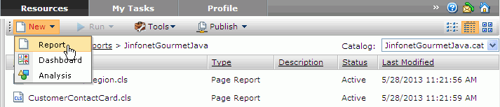
- Go to the My Reports > JinfonetGourmetJava folder, then click New > Report on the task bar of the Resources page.
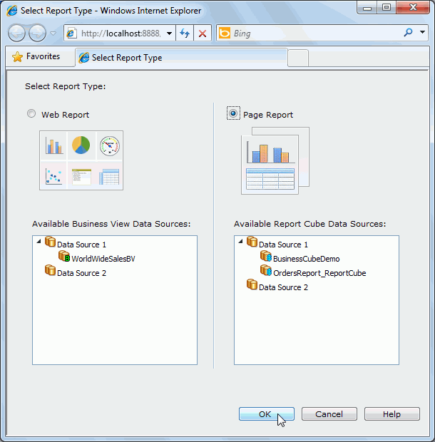
- In the Select Report Type dialog, choose the Page Report option, and then click OK.
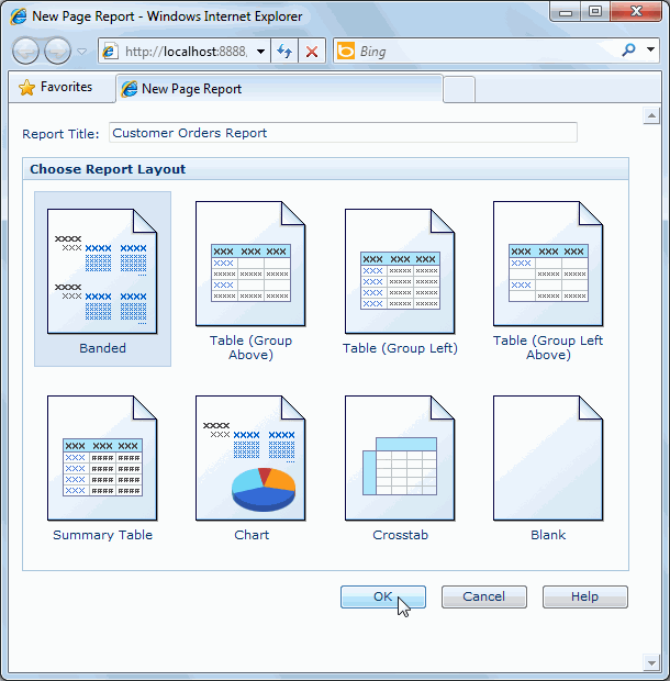
- In the New Page Report dialog, type Customer Orders Report in the Report Title text field, select Banded in the layout box, and then click OK.
The Banded Wizard appears.
- In the Data screen, select BusinessCubeDemo in Data Source 1 from the Data Source list.
Click Next.
A page layout ad hoc report is supported by one and only one business/report cube. The definition of the business/report cube determines what can do on the report and typically this information would be communicated to the business analyst who is building the report.
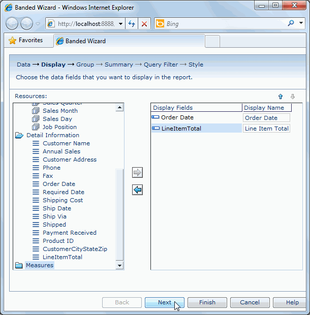
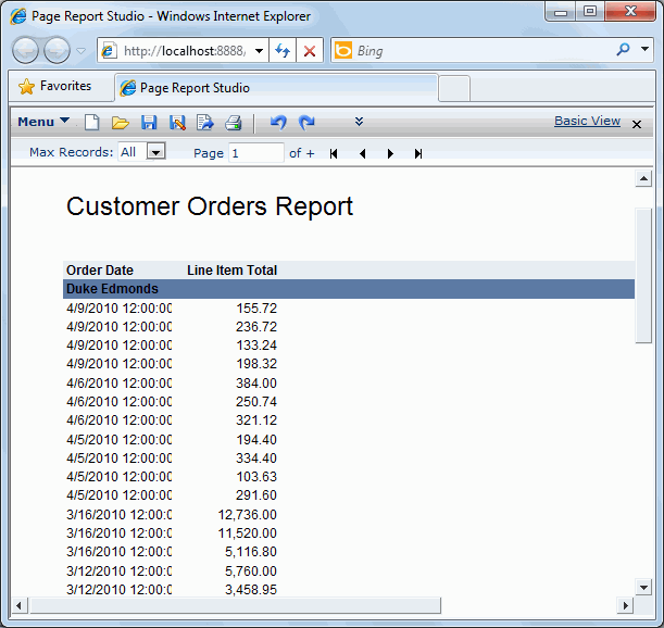
- In the Display screen, expand the Detail Information category in the Resources box, add Order Date and LineItemTotal in it as detail fields one by one by clicking
 , and then modify the display name of LineItemTotal to Line Item Total. Click Next.
- In the Group screen, select Employee Name in the Dimensions category and click to add it as a group by field, keep Ascend as the sort manner, and then click Next.
- Skip the Summary screen and click Next, the same to the Query Filter screen.
- In the Style screen, set the style to ClassicBlue, and then click Finish to create the report.
The report appears as follows:
- Click Menu > File > Rename Report Tab.
- In the Rename Report Tab dialog, enter CustomerOrders as the report tab name, then click OK.
- Click the Save button
 on the toolbar.
- In the Save As dialog, type CustomerOrders in the File Name text field, then click OK.
Task 2: Create a table report
- In the current open report window, click the New Report Tab button
 on the toolbar.
- In the New Report Tab dialog, enter Current Customers in the Report Title text field, select Table (Group Above) in the layout box, then click OK. The Table Wizard appears.
- In the Data screen of the wizard, select BusinessCubeDemo in Data Source 1 from the Data Source drop-down list, then click Next.
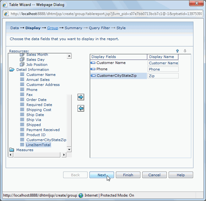
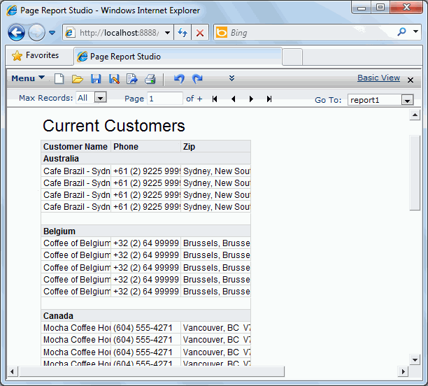
- In the Display screen, expand the Detail Information category in the Resources box, add Customer Name, Phone and CustomerCityStateZip (change its display name to Zip) as the detail fields, and then click Next.
- In the Group screen, add Country in the Dimensions category as the group by field, keep Ascend as the sort manner, then click Next.
- Skip the Summary screen and click Next to access the Query Filter screen.
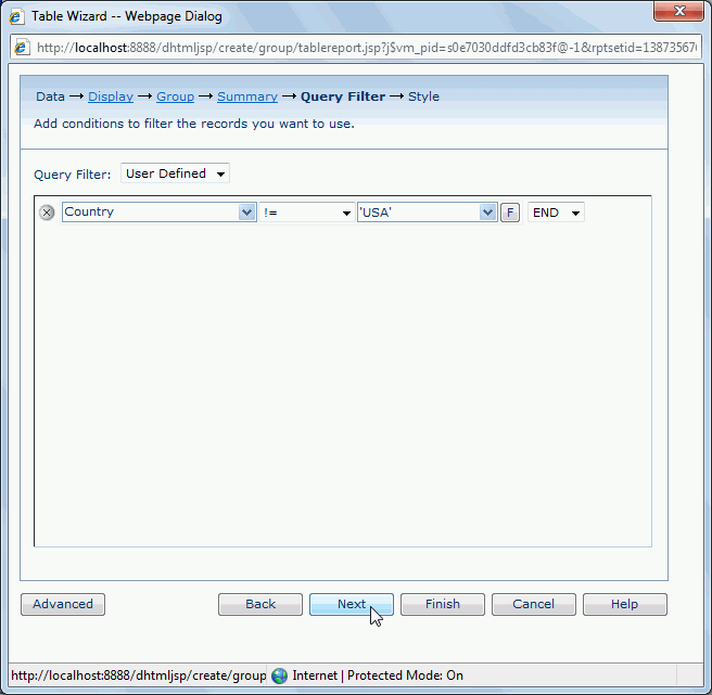
As we would like to focus on customers not in USA, we will apply a filter to the business cube. However, we find that none of the predefined filters in the business cube can meet our requirements, so we will define another one.
- In the Query Filter screen, select User Defined from the Query Filter drop-down list, define the filter as Country != 'USA', then click Next.
- In the Style screen, set the style to ClassicBlue, and then click Finish to create the table report.
The table report appears as follows:
- Click Menu > File > Rename Report Tab to rename the report tab as CurrentCustomers.
- Click the Save button on the toolbar to save the report.
Task 3: Create a crosstab report
- In the current open report window, click the New Report Tab button on the toolbar.
- In the New Report Tab dialog, type Sales Report in the Report Title text field, select Crosstab in the layout box, then click OK. The Crosstab Wizard appears.
- In the Data screen, select BusinessCubeDemo in Data Source 1 from the Data Source drop-down list and then click Next.
- In the Display screen, from the Dimensions category in the Resources box, add Employee Name as the column field and Country as the row field (keep Ascend as the sort manner for both columns and rows), then expand the Measures category and add Total Sales as the summary field. Click Next.
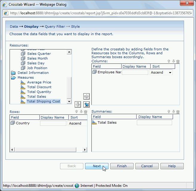
- Skip the Query Filter screen. Click Next.
- In the Style screen, set the crosstab style as ClassicBlue, then click Finish to create the crosstab report.
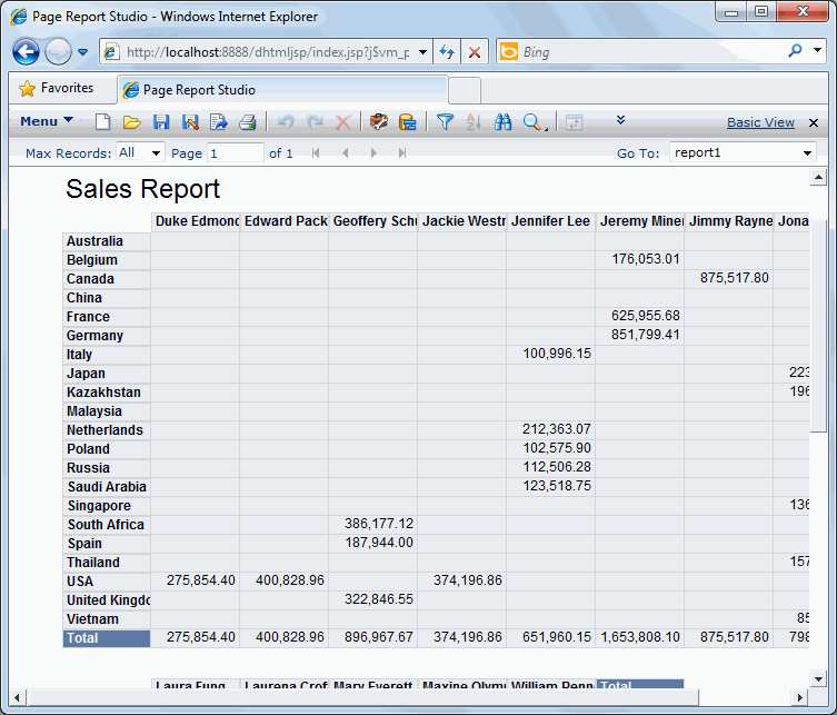
The crosstab report appears as follows:
- Click Menu > File > Rename Report Tab to rename the report tab as Sales.
- Click the Save button on the toolbar to save the report.
Task 4: Insert a chart
In this task, we insert a chart into the Sales report created in Task 3.
- In the current report window, click Menu > View > Toolbox to display the Toolbox panel.
- Drag Chart to place it under the last row of the crosstab.
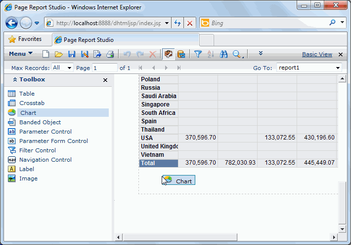
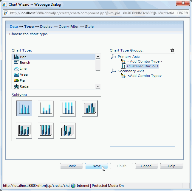
The Chart Wizard appears.
- In the Data screen, select BusinessCubeDemo in Data Source 1 from the Data Source drop-down list, then click Next.
- In the Type screen, select the chart type as Clustered Bar 2-D, then click Next.
- In the Display screen, add Sales Year from the Dimensions category to the Category box and Category in the same category to the Series box, then expand the Measures category and add Total Sales in it to the Show Values box. Click Next.
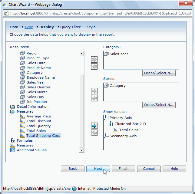
- In the Query Filter screen, select NotMild from the Query Filter drop-down list as the filter and click Next.
- In the Style screen, set the chart style to ClassicBlue, and then click Finish to create the chart.
The chart appears as follows:
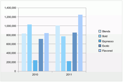
- Click the Save button on the toolbar to save the report.
Lesson 1 summary
In this lesson, we created three report tabs in a page report based on the business cube created in Track 3. The first report tab is a banded report, the second contains a table. In the third report tab, we created two components: a crosstab and a chart which show the same information.