

Lesson 2: Performing data analysis on page reports
Data analysis is the ability to look at the data in a report in another way. That is, to add a cube element to an existing report, to pivot data components, to convert data components, etc.
In this lesson, we perform these data analysis tasks on the report we created in Lesson 1.
This lesson contains the following tasks:
Task 1: Analyze data of a banded object
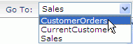
- Click CustomerOrders from the Go To drop-down list on the toolbar to switch to this report tab.
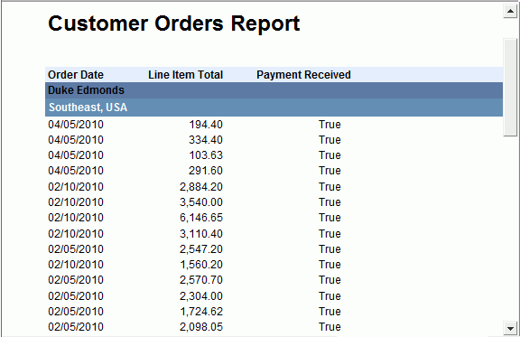
Now, we want to make the records in each Employee Name group further grouped in every possible territory, and to know whether the payment for each order has been received or not.
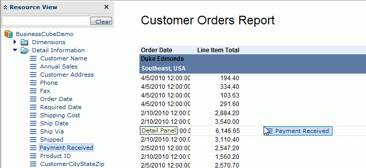
- Close the Toolbox panel and then click Menu > View > Resource View to display the Resource View panel.
- In the panel, expand the Dimensions category, drag Territory to the banded object and drop it as the mouse pointer moves below the Employee Name group header and a tip Group Header appears:
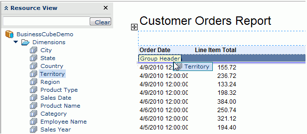
- Drag the Payment Received field in the Detail Information category to the detail panel of the banded object:
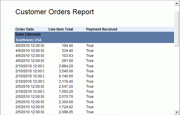
Now the report tab looks as follows:
Next, we will do some adjustments to improve the appearance of the report tab.
- Right-click the label Customer Orders Report and select Properties from the shortcut menu. Then in the Label Properties dialog, go to the Font tab, check the Bold option and then click OK.
-
Right-click any value of the Payment Received field and select Properties from the shortcut menu.
- In the Font tab of the Data Field Properties dialog, set the Horizontal Alignment property to right, then click OK.
- Right-click any value of the Order Date field and select Properties from the shortcut menu.
- In the General tab of the Data Field Properties dialog, set the Format property to MM/dd/yyyy and click OK.
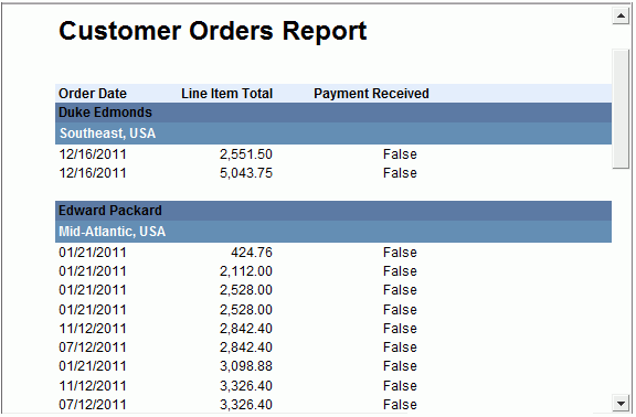
There are two group levels in the banded object, so we will change the background color of the Territory group in order to distinguish the two levels.
- Right-click the group header panel of the Territory group, which is shown as GroupHeaderPanel1 on the shortcut menu, and click Properties on the menu.
- In the General tab of the Banded Panel Properties dialog, set the Background property to #668cb2, and then click OK to confirm.
Click the Next button  on the toolbar (or just simply scroll down the mouse wheel) to view page 2 and repeat this to view the next pages, and you may find the interval between every two Territory groups, which is the group footer panel. So next, we will make it invisible.
- Right-click the GroupFooterPanel1 which is footer panel of the Territory group and select Properties from the shortcut menu.
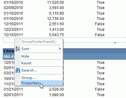
- In the General tab of the Banded Panel Properties dialog, set the Height property to 0 and click OK.
Now the report tab looks as follows:
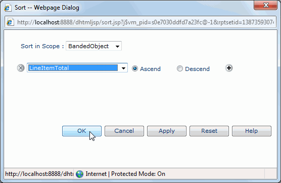
Next, we will do some sorting and filtering on the report tab. We would like to sort the records in each group by Line Item Total ascendingly, and filter the records to only show orders without a payment received.
- Click the Sort button
 on the toolbar to open the Sort dialog.
- In the Sort dialog, select BandedObject from the Sort in Scope drop-down list, choose LineItemTotal from the field drop-down list, keep the sorting manner as Ascend, and then click OK to apply the settings.
- Right-click any value of the Payment Received field, and on the shortcut menu, click Filter > False.
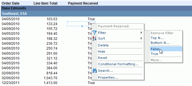
After doing the sorting and filtering, the report tab looks as follows:
In the above two steps, we used two ways to sort and filter the report results: one by dialog and the other by right-click menu command. In fact, both sorting and filtering can be achieved by either way.
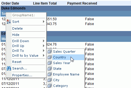
We have defined two grouping levels in the banded report: one by Employee Name and the other by Territory. Next, we will change one of the grouping criteria: grouping the banded object by Country instead of Territory.
- Right-click any of the Territory value ("Southeast, USA" for example) and click Drill To > Country on the shortcut menu.
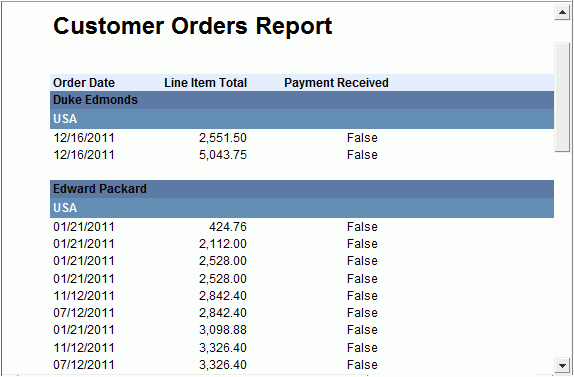
The report result finally changes to:
- Click the Save button
 on the toolbar to save the changes.
Task 2: Analyze data of a table
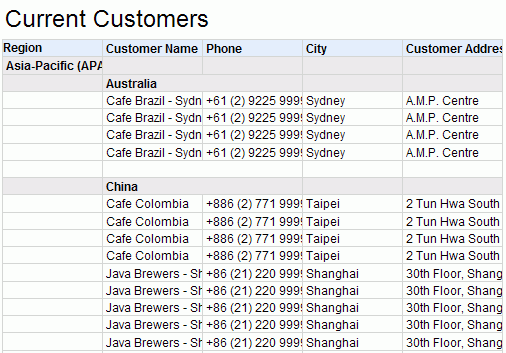
- Select CurrentCustomers from the Go To drop-down list on the toolbar to switch to this report tab.
First, we want to remove the zip information from the table as we think it is not required.
- Right-click the Zip label and select Remove Column from the shortcut menu to delete the Zip label and its corresponding DBField.

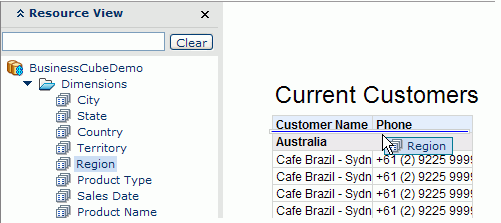
Next, we will add a group Region, and make its level higher than the existing Country group.
- Make sure the Resource View panel is shown, then drag Region in the Dimensions category from the panel to the upper part of any Country group header:
Next we want to add some detail fields to the table. We can do this either by dragging or using dialog.
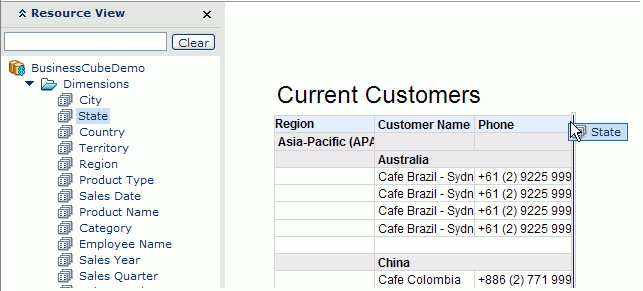
- Drag State in the Dimensions category from the Resource View panel to the right part of the Phone column and drop it when a blue line occurs along the right boundary of the column.
- Click anywhere on the table, when the icon
 appears at its upper left corner, right-click the icon and select Insert > Detail Column from the shortcut menu.
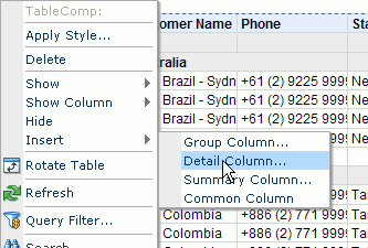
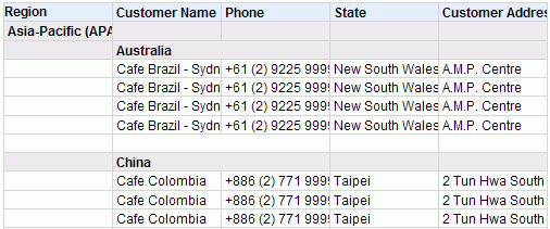
- In the Insert Detail Column dialog, select Customer Address in the Detail Information category, then click OK. A detail column, Customer Address, will be added to the right of the State column.
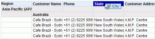
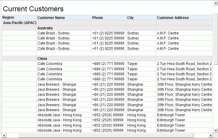
However, we now consider the state information is not very useful because we will care more about the city information. So we can overwrite State with City.
- Drag City in the Dimensions category from the Resource View panel to the State column label and drop it when this title is highlighted:
The report result becomes:
- Resize the Customer Name column by dragging the boundary to the right of the column to make all the customer names in the column displayed entirely.
- Repeat the resizing step for the Region, Phone, City, and Customer Address columns.
The report result finally changes to:
-
Click the Save button on the toolbar to save the changes.
Task 3: Analyze data of a crosstab
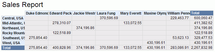
- Click Sales from the Go To drop-down list on the toolbar to switch to the report Sales, which contains a crosstab and a chart.
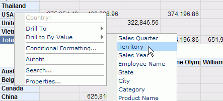
- Right-click USA in the row header, and select Drill to By Value > Territory to obtain a more detailed view of USA information.
The report tab is regenerated to show data of territories in the USA:
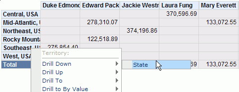
Next, we want to further view the details about the territory Southeast of USA. Because Territory is a level predefined in the hierarchy Geography of BusinessCubeDemo, we can drill it down to the State level.
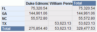
- Right-click Southeast, USA in the row header, and select Drill Down > State from the shortcut menu.
Now, only data of states in the Southeast territory is displayed:
We can further drill any State down to City in this way if necessary. Here, let's leave the crosstab as it is.
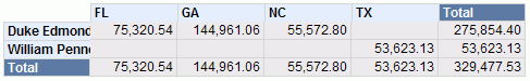
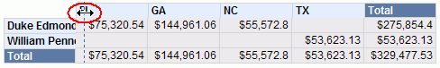
Next, we want to pivot the crosstab, namely interchange the rows and columns.
- Click any cell of the crosstab, then click Menu > Report > Rotate Crosstab, and the crosstab changes to:
- Right-click any value and select Properties from the shortcut menu.
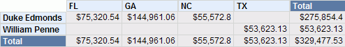
- In the General tab of the Data Field Properties dialog, set the Format property to $#,###.##, then click OK to confirm.
- Resize the row header to make sure all the employee names can be shown completely (if the resizing arrows does not appear when you move the mouse pointer to the boundary of the row header, you can resize the height of the rows a little bit first).
The report result finally changes to:
-
Click the Save button on the toolbar to save the changes.
Task 4: Analyze data of a chart
Now let's focus on the chart at the lower part of the Sales report. In JReport, a chart can be converted to crosstab, and vice versa. So we will convert the chart to a crosstab first.
- Right-click anywhere on the chart and select To Crosstab from the shortcut menu.
- In the Display tab of the To Crosstab dialog, add Sales Year to the Columns box, Category to the Rows box, and Total Sales to the Summaries box, then click Next.
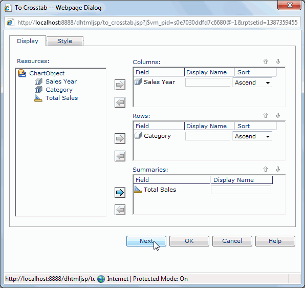
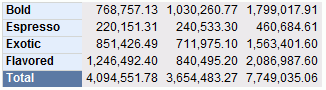
- In the Style tab, set the crosstab style as ClassicBlue, and then click OK. The chart is successfully converted to a crosstab.
Now, we want to return the crosstab to a chart, and change the chart type to pie chart.
- Click the menu command Menu > Edit > Undo to cancel the operation of converting chart to crosstab.
We can also select any cell of the crosstab and click Menu > Report > To Chart to convert the crosstab to chart.
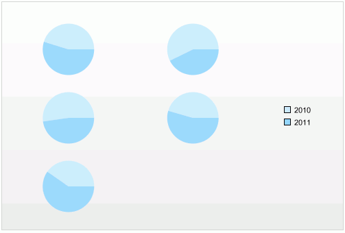
- Right-click anywhere on the chart, and on the shortcut menu, click Chart Type > Pie > Clustered Pie. The chart appears as follows:
Next, we will format the chart.
- Right-click the platform of the chart and select Format Chart from the shortcut menu.
- In the Chart Type tab of Chart Definition dialog, select Bench from the Chart Type box, and select the Bench 3-D thumbnail.
- Click the Display tab, select Sales Year in the Category box and click
 to remove it, then expand the Dimensions category in the Resources box and add Category to the Category box. Remove Category from the Series box and add Sales Year in the Dimensions category to the box. Add Total Sales in the Measures category to the Show Values box.
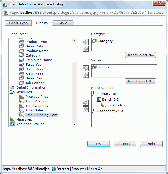
- Click the Style tab, apply the ClassicBlue style to the chart, then click OK to apply the changes.
The chart now appears as follows:
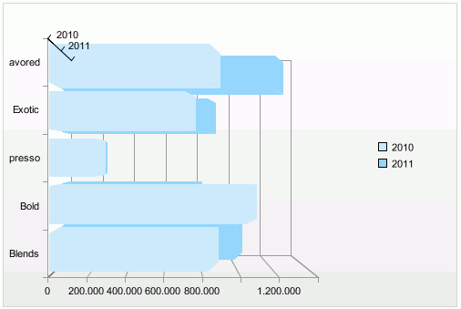
- Right-click the chart, select Format Paper from the shortcut menu.
- In the Format Paper dialog, click the Coordinate tab, set Scale X to 80, Scale Y to 80 and Angle Y to 12, then switch to the Graph tab and set Bar Width to 30. Click OK to confirm.
- Right-click the chart, and on the shortcut menu, select Format Platform.
- In the Format Platform dialog, click the Border tab, set Border Type to solid and Color to #66ccff, then click the Data tab, set Sort Category to ascend and Sort Series to descend. Click OK to confirm.
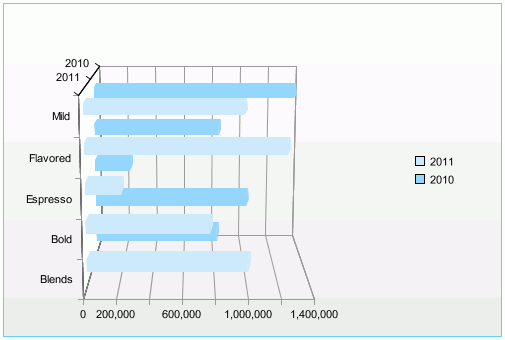
Finally the chart looks as follows:
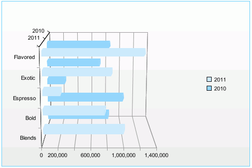
Next, we want to edit the predefined filter applied to the business cube the chart uses to show any category which is not Exotic.
- Right-click anywhere on the chart and click Query Filter on the shortcut menu.
- In the Query Filter dialog, click the Edit button, then modify the value of the filter condition to 'Exotic'. Click OK to apply the changes.
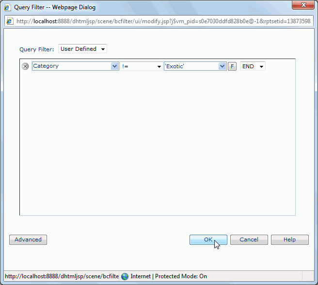
We can find that after editing a predefined filter of a business cube in Page Report Studio, it is then saved as a user defined filter in the business cube.
The chart now becomes:
-
Click the Save button on the toolbar to save the changes.
Lesson 2 summary
In this lesson, we performed some data analysis tasks on the four data components we created in lesson 1 respectively. We applied some sorting and filtering conditions on the banded object, added and removed some columns in the table, drilled around the crosstab, and converted the chart into a crosstab and changed the chart type.