

Lesson 3: Creating and working with web reports
End users can create web reports, which are also called web reports, on JReport Server if a business view is available. In this lesson, we will create a web report as an end user. The report should contain a table, a crosstab, and a chart.
This lesson contains the following tasks:
Task 1: Create the web report
- On the JReport Console > Resources page, go to the My Reports > JinfonetGourmetJava folder, then click New > Report on the task bar of the Resources page.
- In the Select Report Type dialog, select Web Report and click OK. The Web Report Wizard appears.
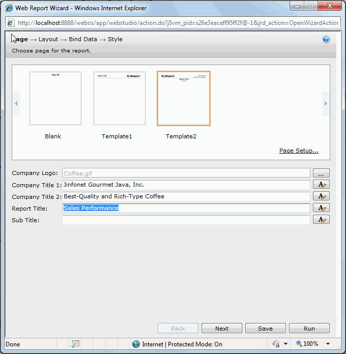
- In the Page screen of the wizard, select Template2, which allows for company log, company name, report titles to be defined and added in the report's page header panel. Click
 to browse to the directory
 <install_root>\help\samples\JinfonetGourmetJava, select Coffee.gif as the company logo. In the Company Title 1 text field, input the company name Jinfonet Gourmet Java, Inc.. In the Company Title 2 text field, input Best-Quality and Rich-Type Coffee. In the Report Title text field, input Sales Performance. Leave the Sub Title text field blank.
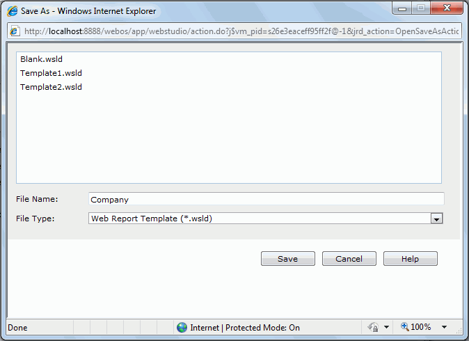
We would like to save the above company information for use when creating other web reports which require the company information.
- If you are an administrator with the publish privilege, you can save a report template. Click the Save button in the Web Report Wizard. Then in the Save As dialog, type in Company as the file name, set File Type to Web Report Template (*.wsld), then click Save.
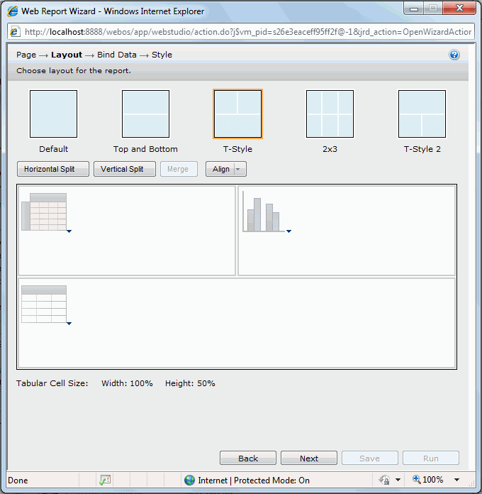
- Click Next in the Web Report Wizard to go to the Layout screen.
- In the Layout screen, select the T-Style layout. In the first tabular row, click the Click here to select component link in the left cell, select Crosstab from the drop-down menu, select Chart for the right cell. For the bottom cell, select Table from the drop-down menu.
- Click Next to go to the Bind Data screen to define data for the three components one by one.
Since we have only one business view in the catalog, the business view is selected as the data source by default for the three components. We will go straight to data addition.
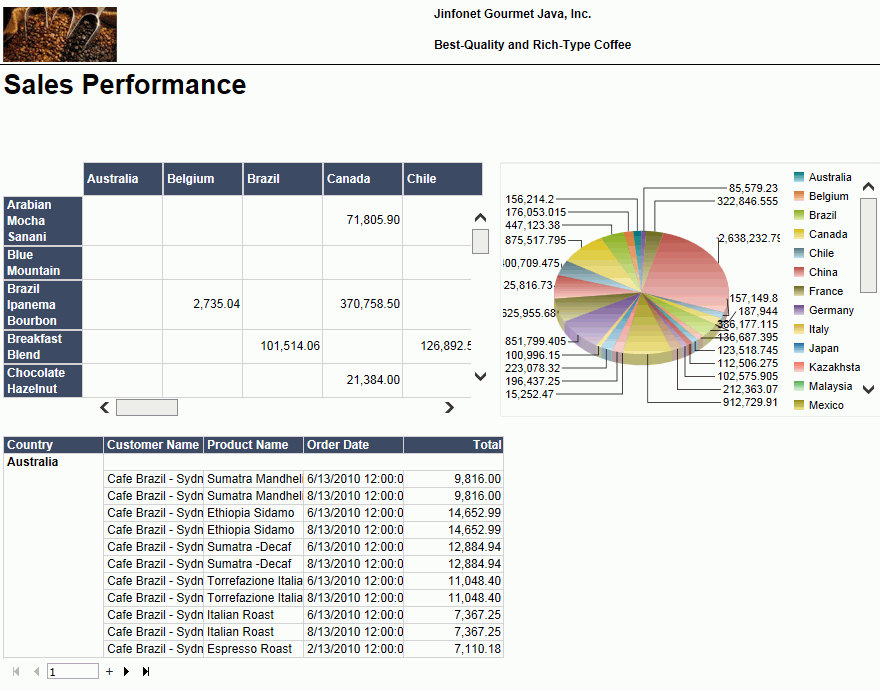
- First define the crosstab. Add the group element Country to the Columns box, Product Name to the Rows box, and Total Sales to the Summaries box.
- Click Next to define the chart. Add the group element Country to the Category box, then from the chart type drop-down list in the Show Values box, select Clustered Pie, and add Total Sales as the data of the type.
- Click Next to define the table. In the Display tab, add these fields: the group element Customer Name, Product Name, Order Date, and Total. In the Group tab, add Country as the group by field.
- Click Next to display the Style screen and select Neutral as the style.
- Click Run and the report is opened in Web Report Studio.
- Click the Save button
 on the toolbar.
- In the Save As dialog, type SalesPerformance in the File Name text field, then click Save to save the web report.
Task 2: Work with the web report
In this task, we will format the web report to make it look nicer, perform some operations on the data components, and dynamically filter the data.
We will first change the style of the crosstab and table in the report, and then format the chart to show the values for the chart segments in percentage, and also include the country names in the tips so as to help identify the segments.
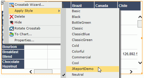
- Click Edit Mode on the toolbar.
- Click anywhere on the crosstab, when the icon
 appears at its upper top left, right-click the icon, then select Apply Style > JReportDemo from the shortcut menu.
- Change the style of the table to JReportDemo too using the same way.
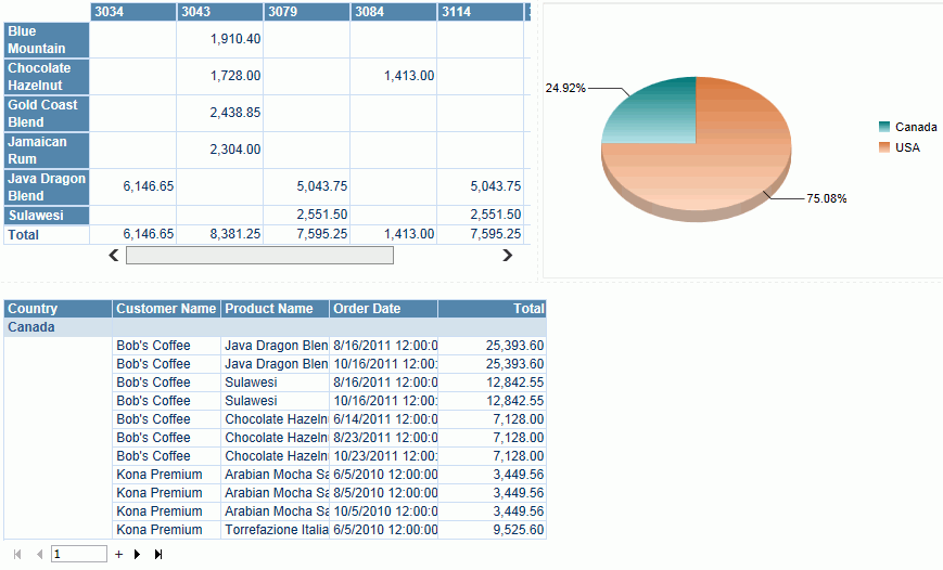
- Right-click on the chart and click Format Paper on the shortcut menu. In the Format Paper dialog, select Show Category and Series in the General tab, in the Graph tab, set Type to Percent, then click OK. The chart now displays as follows:
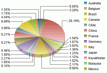
Point the cursor on the largest pie section of 26.19%, we can easily see that it is USA that is the company's biggest market.
Next we will perform some operations on the crosstab, chart and table respectively. First, we will change the data view from Country to Customer Name in the crosstab.
- Right-click the column header which displays countries, select Switch Column > Customer Name from the shortcut menu. The column header now displays customer names.
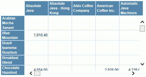
- To further view the customer Absolute Java's order ID information, right-click Absolute Java in the column header, select Go to by Value > Order ID from the shortcut menu. The crosstab now shows Absolute Java's orders of different products.
For the chart, we will link the values to a table which contains detailed information about the values.
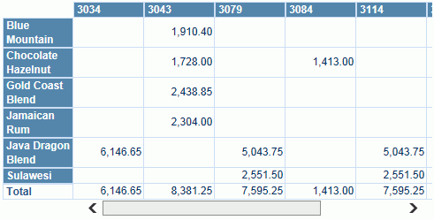
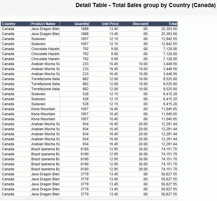
- Right-click the pie, select Edit Detail Table. In the Edit Detail Table dialog, add these fields to the right panel concerning the total sales in the countries: Country, Product Name, Quantity, Unit Price, Discount, and Total, then click OK.
- Now we can view the details about the chart values. Right-click the total sales in Canada and click Go to Detail on the shortcut menu. The following table will be displayed showing the information about Canada.
- Click
 on the toolbar to return to the main report.
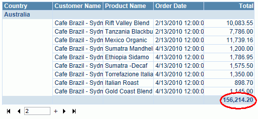
For the table, we will summarize the total sales for each country group and for all the countries.
- Right-click any value in the Total column, then select Aggregate On from the shortcut menu. In the Aggregate On dialog, set Function to Sum, then click OK. You will see the total sales for each country group is added at the end of each group and the total sales for all the countries is added at the end of the table.
This operation also creates a dynamic aggregation which is given a default name Sum_Total. You can find it in the Dynamic Resource > Aggregations list in the Resources panel and you can use it again in the report.
The three data components in the report use the same business view, therefore we can apply filters to them at the same time. There are two tools to use: the Filter panel and filter controls. For the usage of filter controls, you can learn from Lesson 2: Creating a web report using JReport Designer. Here we focus on using the Filter panel to dynamically filter report data.
We would like to view data about the North America region, so we need to add the Region field to the Filter panel.
- Expand the Filter panel on the left. Click + on the title bar of the Filter panel, then in the Select Field dialog, select Region and click OK. The Region field will be added in the Filter panel with its values.
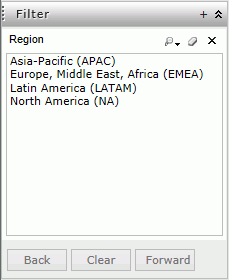
- Click North America (NA) in the Region box. The report comes out as follows:
-
Click on the toolbar to save the report.
Lesson 3 summary
In this lesson, we created a web report containing a table, a crosstab, and a chart from the view of an end user on JReport Server, added company information in the report header, performed several actions on the data components, and used the Filter panel to filter the desired data. The report
template was then saved in the server version system and can be uploaded to
JReport Designer to make more advanced changes to it if desired.